Nubank
MMXXV–MMXXVI
Nubank
MMXXV–MMXXVI
May 2025 to April 2026. Nu launched it in the US on September 10, 2026.
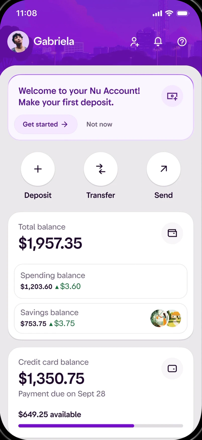
Nubank’s US app started as a concept deck that nobody had built. I turned it into a complete product on one Home that stays put, and every Nu market adopted that Home as its core.
The start
Nu was getting ready to enter the US and to redesign its app at the same time. The new patterns existed only as a company-wide concept deck: no prototypes, no screens, no flows.
Four business units were building toward the US in parallel, each with its own design lead and its own priorities. Brazil, with most of Nu’s customers, had the company’s attention. Without someone speaking for the US, it would have become a patchwork of other markets’ decisions.
Early testing showed what that meant for customers. New US customers, expats among them, didn’t understand the single account model, were confused by widgets that kept changing, and couldn’t see what to do next.
Two things were fixed from the start. Home is put together by the server, which limits what a screen can do, and the US launch date did not move.
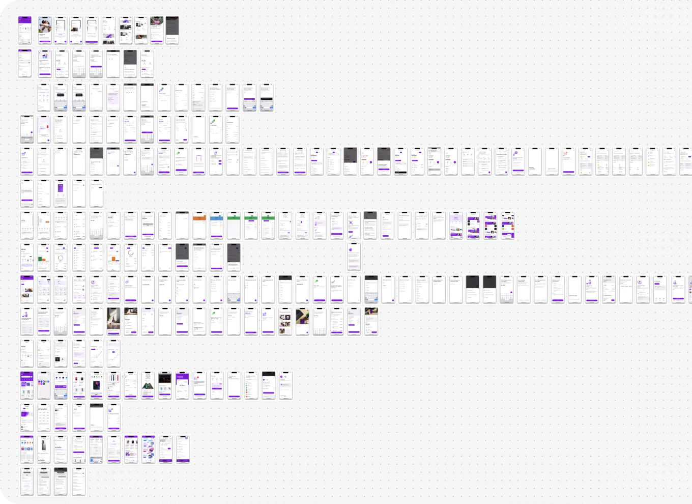
26product dashboards
185feature flows
What I inherited across Nu’s markets, with no shared hierarchy. That is the whole company’s product, not a count of what I designed.
The process
I gathered every design lead the US depended on, and the design system team, to agree on patterns that would connect globally but be led through the US.
I brought each business unit into one US experience. As the only US citizen in the group, I brought how banking, law and expectations differ here.
With the redesign team I turned their concepts into a working Home, with the US as the proof the patterns would hold everywhere.
When the Chief Design Officer joined, I briefed him on what the US needed. He helped put the US ahead of Brazil for the design system and redesign teams.
I stood up the US marketing team and led it, then brought in a dedicated lead when it was too much alongside the product.
After months of pitching other markets and business units for resources, we got global approval and could move fast.
Before launch, everyone responsible walked through the live app together and agreed what to change.
The product was complete. Nu launched it publicly on September 10, 2026.
Decision 1
The idea I inherited was a smart Home that rearranges itself around what you’re doing. We tested it with people in Brazil, then in the US. Try both.
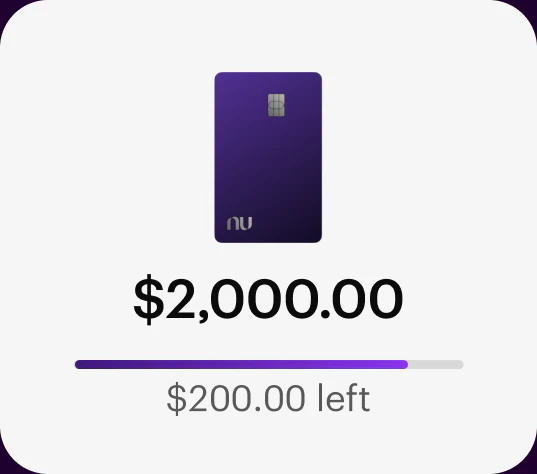
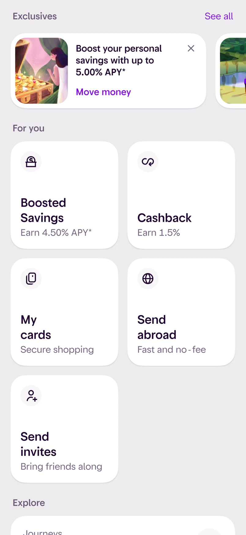
Widgets stay where people put them. Each one has three states: inactive, active and cross-sell.
People thought we were going to take their widgets away.What testing showed, in Brazil and then in the US

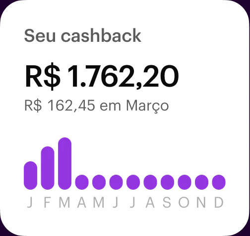
Before: the smart widgets we tested. Each one looked and behaved its own way.
After: one widget, in three forms.
1234Making it buildable
A Home that every team plugs into the same way also held up across business units.
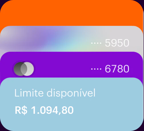
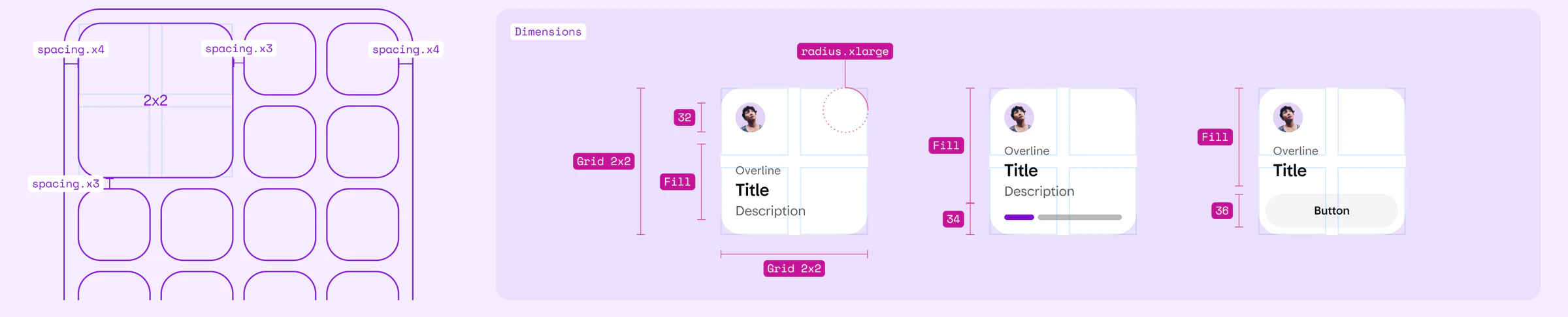
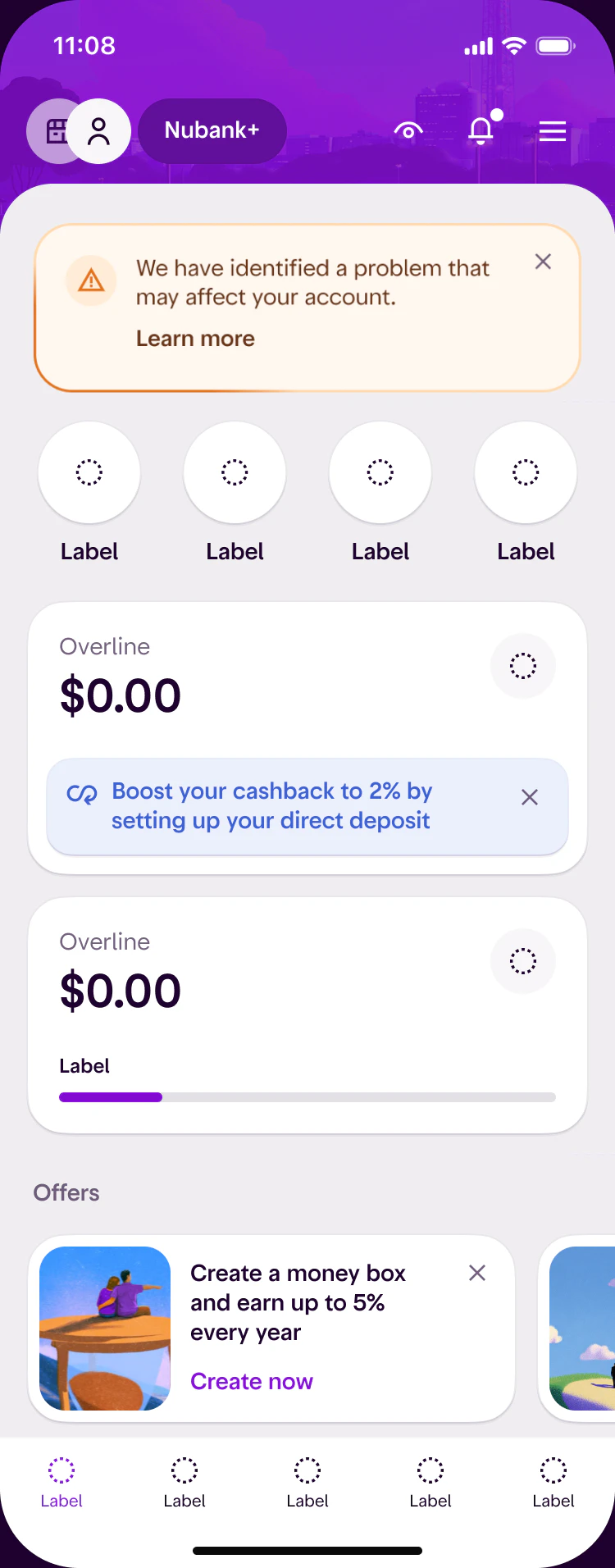
Widgets follow two layouts, 2x2 and 4xN, with set spacing and sizes, so a team could build one without asking. Movement stays only where people expect it: virtual cards, and sending money again to the same people, like family back home.
We didn’t over-index on getting it perfect. We simplified so teams could move.What I told the teams at the time
Decision 2
Rather than adapt Brazil’s app, I made the US the first product built entirely on the new patterns and the newest design system components.
That meant winning over far more than the US team. It had to work for the CEO and the US CEO, and for the Brazilian product teams, who serve millions of customers with many more products. So Home had to give every business unit and every product a place of its own.
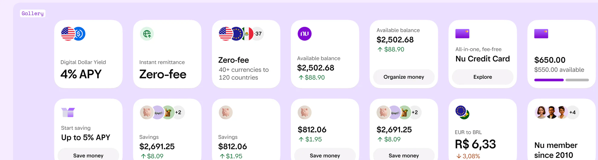
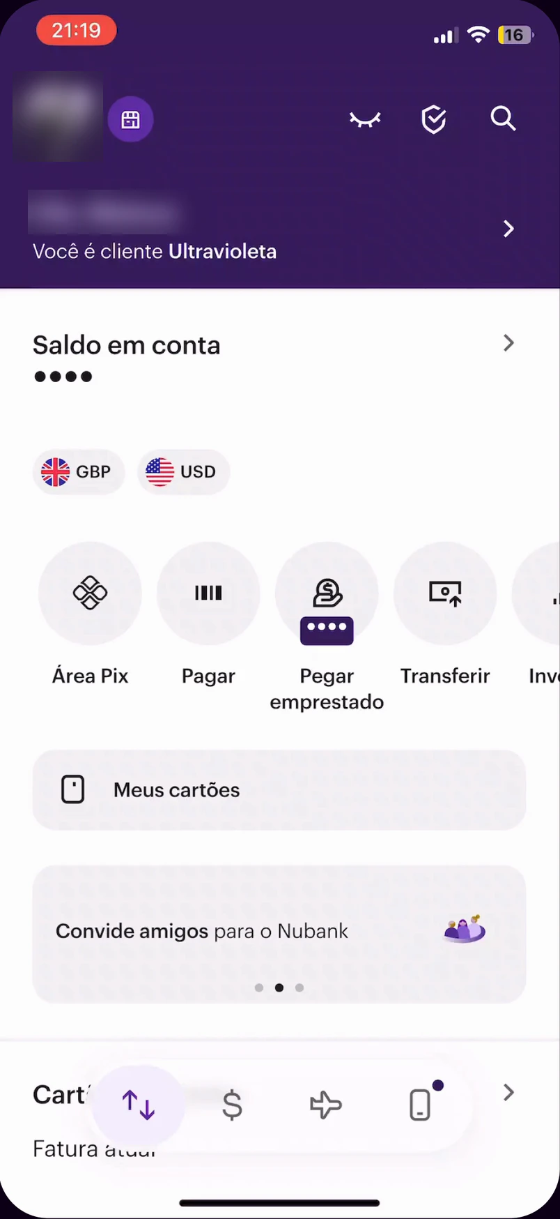
What I led in the US was adopted as the core for every market, each rolling out on its own timeline:
Before and after
Before, teams had solved the same problems in different ways. After, every product, action and message has a set place.
Decision 3
Taking the movement out of the widgets meant giving it one deliberate place.
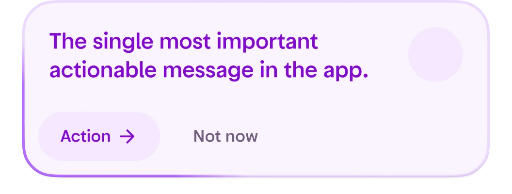
Before, offers were scattered and showed up differently across the app. Next Best Action became the single entry point. Messages are ranked by urgency and impact, and only one is shown: the thing that needs the customer now. The next ones wait their turn.
I kept it apart from notifications and from offers, so it never became a copy of either. An offer appears there only when it is the most important thing for that customer. Teams got a component and the rules for choosing the message.
Priority also decides where a message sits: what is urgent goes to the top of Home, and offers go to the bottom.
Working together
With the Chief Design Officer I ran sessions where everyone responsible for the launch went through the product together.
Executives, product managers, designers and engineers saw how the product looked and behaved with the components we had. I recorded the live app, slowed the animations down and went through them frame by frame, but most of it came down to live demos.
The sessions kept growing, because more people wanted to see the changes that might affect their own team and dates. The launch depended on every one of them lining up.
Go through the live app, screen by screen.
Agree what needs to change.
One person for each change.
A timeline every team can plan around.
The app
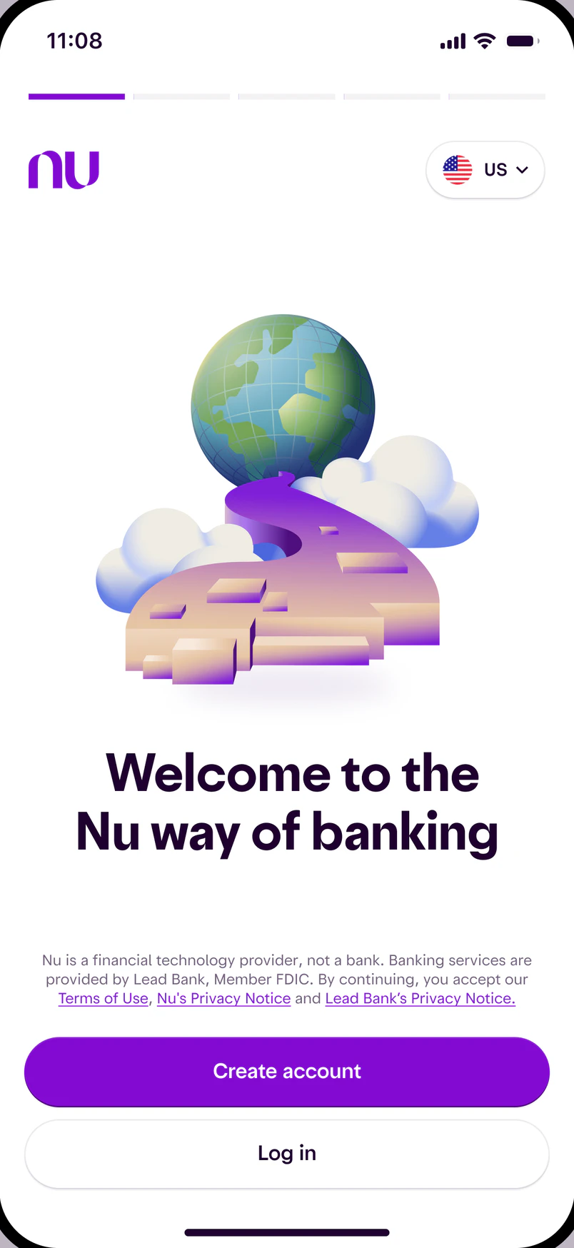
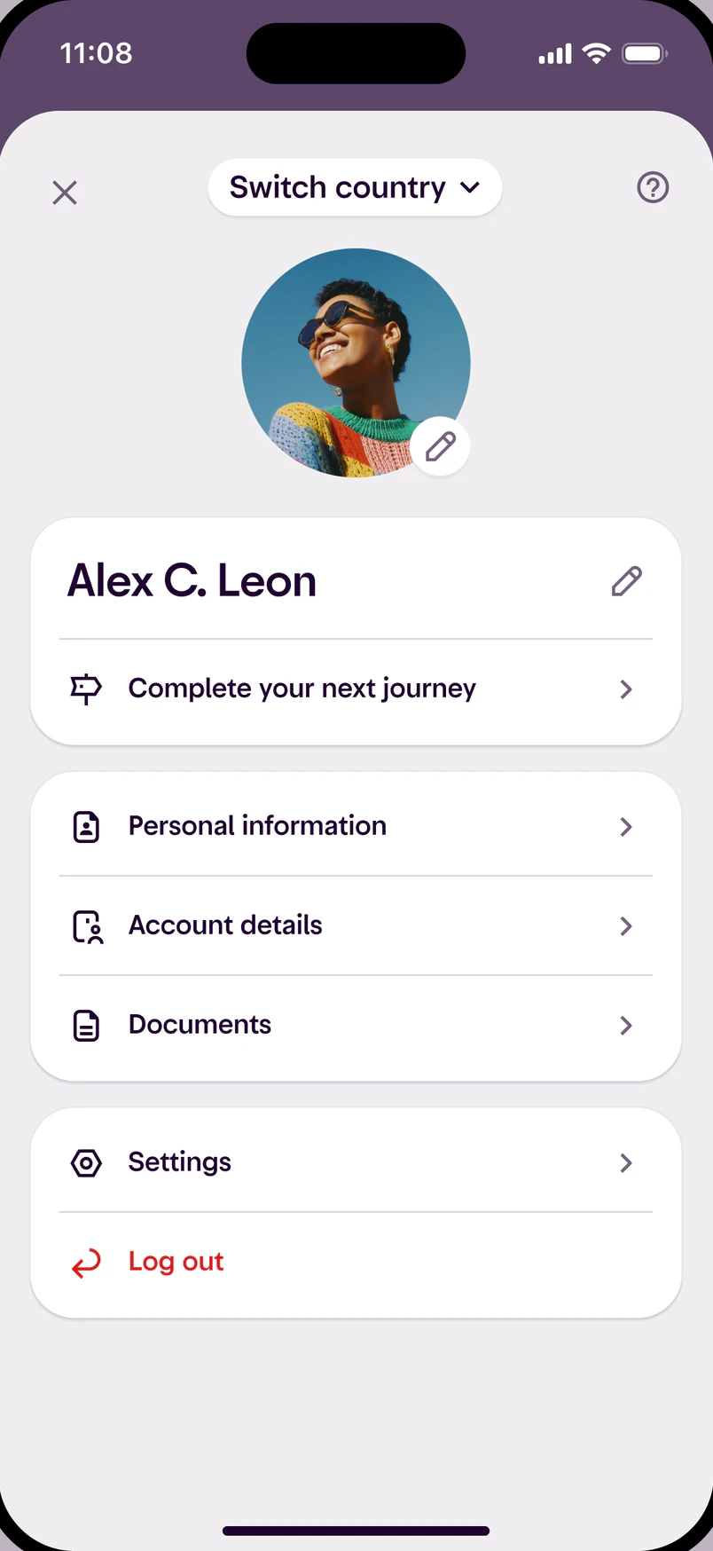
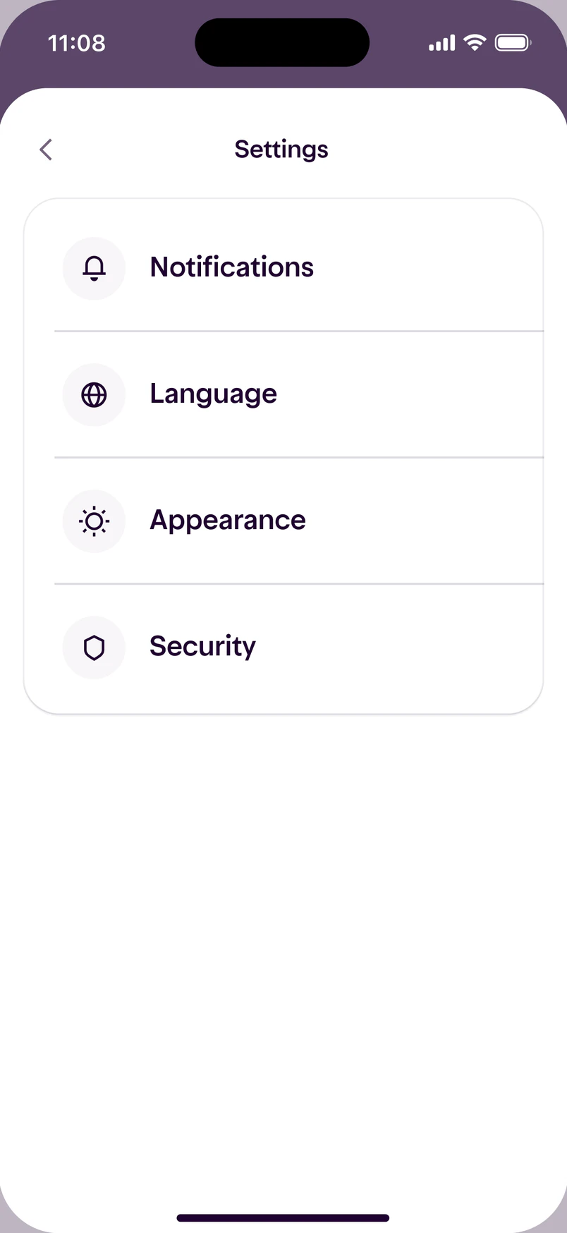
Welcome, Home, For you, Profile and Settings.
Nubank
The rebirth
A name
Savings came to the US as “Money boxes”, a straight translation. Research showed the words weren’t the problem. The meaning was.
Little boxes. People split their cash into envelopes to keep themselves honest.
The same idea in Spanish, and the same habit behind it.
One place that is mine, and a memory of saving coins as a kid.
Koto created Nu’s 2026 brand system. I directed how it was applied in the US: illustration, imagery and photography, the Piggy Bank included.
Craft
One template system behind cross-sell, Journeys, offers and welcome banners, so each team could ship a new message without a custom screen.
The most repeated gesture in a banking app, and the moment the new Home feels alive.
How the profile and account details load, worked out hand in hand with engineering over several rounds until it held up.
123Nu has one account per country, and some of our first US customers already had one in Brazil, Mexico or Colombia. To them it was one product with several logins, and that was confusing.
In my first month I gathered every design lead the US depended on, across business units and markets, plus the design system team. We agreed on the patterns before anyone built.
We tested the smart widgets with people in Brazil, then in the US. Both groups said the same thing, so the simpler Home had evidence behind it.
Rather than adapt Brazil’s app, the US became the first product built entirely on the new patterns. That is why the other markets could adopt it.
With the Chief Design Officer I ran sessions where every executive, product manager, designer and engineer on the launch went through the live app, decided what to change and named an owner.
People thought we were going to take their widgets away and change their Home for them.
What I changedEvery widget has three states and stays where people put it.
Savings came to the US as a straight translation. In research, people didn’t know what a money box was.
What I changedIn the US it is the Piggy Bank.
I stood up the US marketing team and led it alongside the product until the load was too much.
What I changedI brought in a dedicated lead from outside the launch.
The Home came out practical when it could also have been expressive.
What I’d changeKeep the structure, and spend the extra weeks making each widget feel like yours.
For your team
At Nubank I used Claude and Cursor to prototype product ideas. On Panols I took my own idea all the way to the App Store.