Healthy
Together
MMXX–MMXXIV
Healthy
Together
MMXX–MMXXIV
Summer to fall 2021
Maryland’s farmers market benefits ran on paper checks, and the state needed a digital service for residents, farmers and market managers in time for the season. I designed the mobile experience and the design system under it, and changed the product wherever real use proved us wrong: manual entry for seniors who struggled with QR codes, and sales that work with no signal. We delivered everything the RFP asked for in half the quoted time, and the same system later became two more state programs with little more than a rebrand.
The start
Maryland’s farmers market benefits ran on paper. Residents got checks and coupons, farmers took them at their stalls, and market managers reconciled everything by hand.
That meant slow processing, a lot of administrative work, and benefits that went unspent. The state needed a digital service for all three groups in time for the 2021 market season.
The RFP quoted 24 weeks.
The service
Residents
Seniors and WIC participants, with very mixed confidence with phones.
They needed to see their balance and pay without learning a complicated system.
Farmers
Selling outdoors, often with little digital experience.
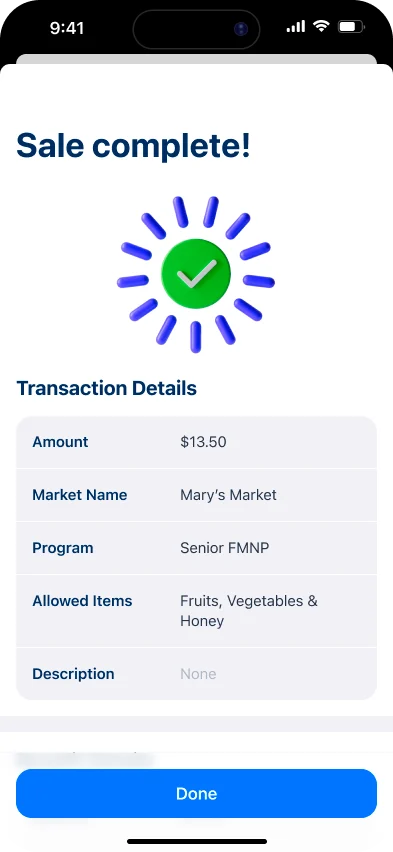
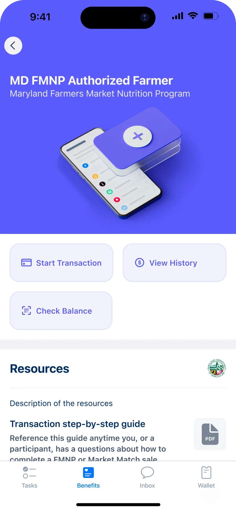
They needed to take a payment and know they’d been paid.
Market managers
They issued benefits and cards and supported participants.
They reconciled every transaction.
A market manager issues benefits and cards.
A resident sees what they have to spend.
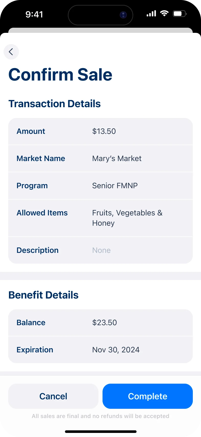
The resident pays a farmer at the stall.
Every sale is matched back to the program.
The process
With the RFP writers and sales, I used production-ready work and fast mockups to make the service concrete and shape what we committed to.
Once we won it, I mapped the whole service, from issuing benefits to reconciling them.
For residents and administrators, so the state’s feedback could shape the scope before engineering started.
Components, tokens and flows for every group and every platform.
The work for farmers, residents and market managers overlapped instead of running one after another.
We tested with real seniors and farmers, and changed the product where it failed them.
Design and engineering went through the builds together every week.
The 2021 season. 18 markets were live in the first week.
Decision 1
The RFP quoted 24 weeks. We delivered all of it in 12, and we didn’t cut anything to get there.
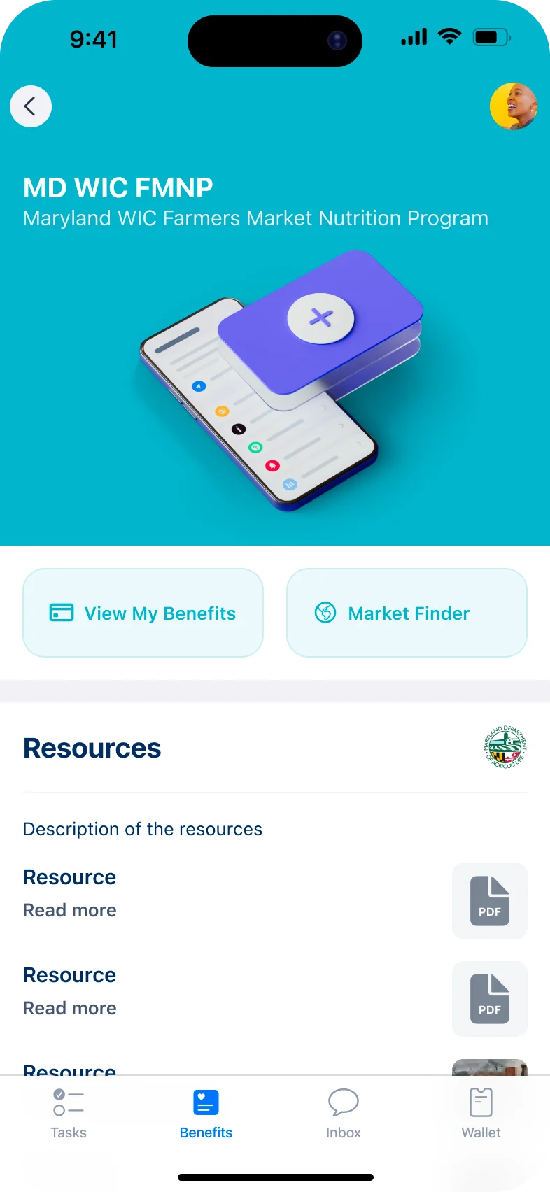
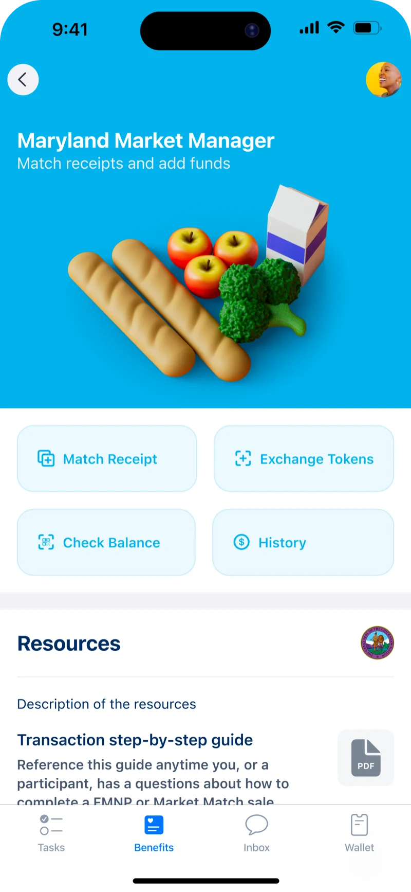
The speed came from how the platform was set up, and above all from the design system I built: one set of components, tokens and flows that gave residents, farmers and market managers each their own experience.
Engineering reused patterns instead of waiting for new screens, and the work for each group ran at the same time.
Decision 2
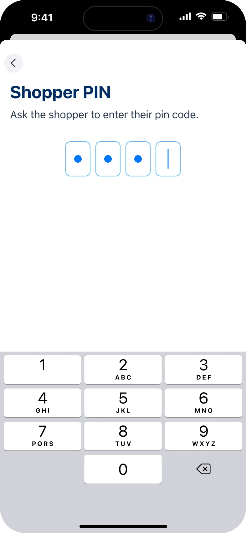
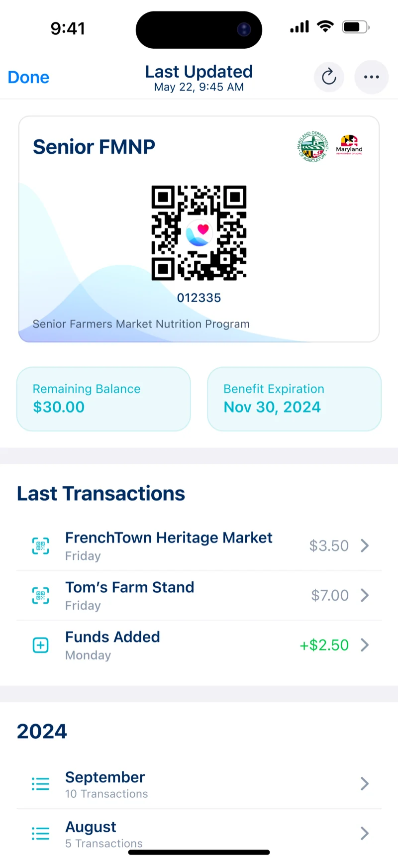
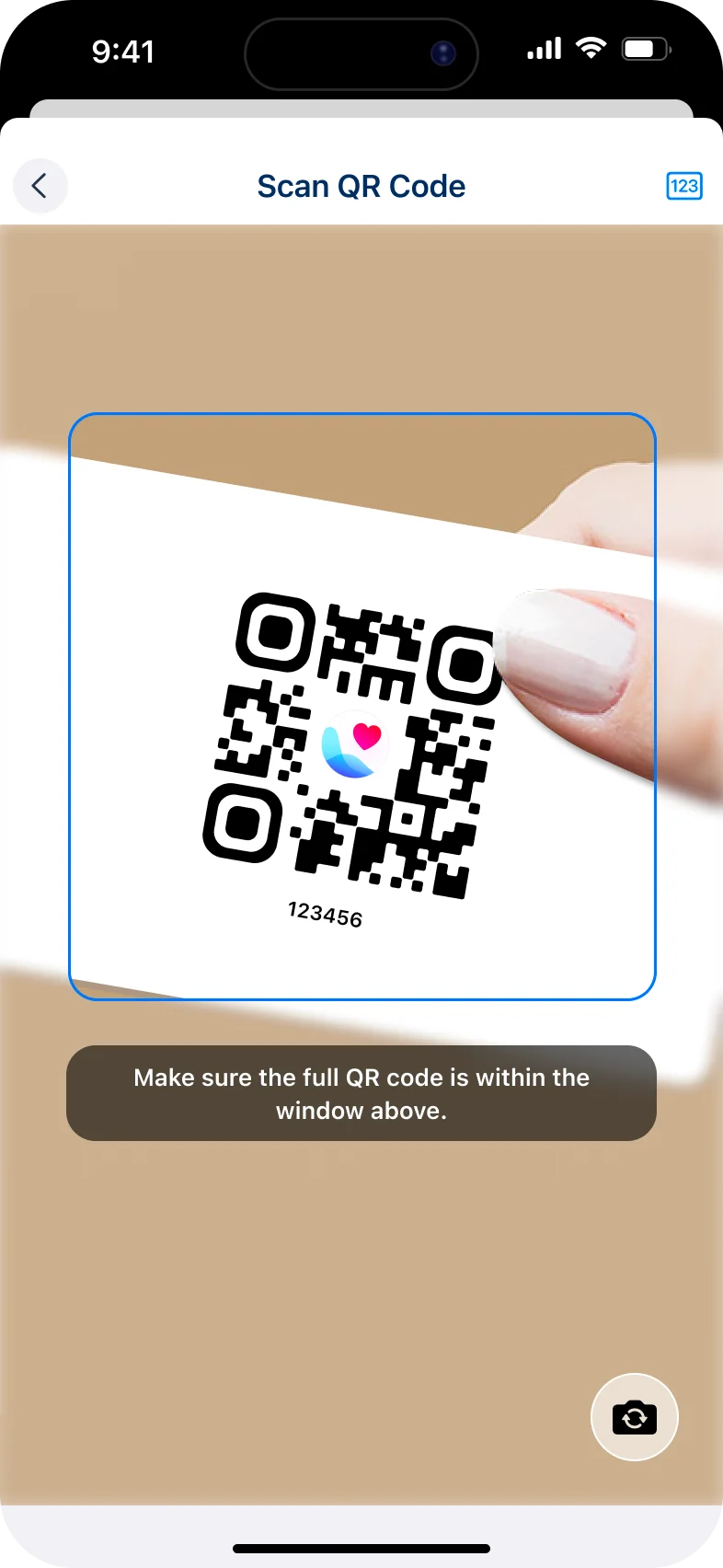
The ideal flow was scan and pay. In the field, scanning was exactly where people got stuck.
We tested the app with real seniors and farmers, and scanning a QR code was where they struggled. Other users told us the same.
So residents got manual entry alongside the QR code, with large tap targets and the balance always in view.
Decision 3
Farmers markets are outdoors, often with a poor connection. A design that had to be online would have failed at the stall.
Farmers could complete a sale and see balances with no signal. The app reported back when service returned, so every transaction reconciled.
The farmer’s flow has one clear action per step and says plainly what happened, for outdoor use and limited dexterity.
Working together
Discovery, prototyping and engineering ran at the same time, so I stayed in the work through QA and the pilot.
Every week, design and engineering went through the builds together.
Behaviour, accessibility and edge cases.
Pilot feedback, ordered by its effect on users.
Into the next iteration.
Healthy Together
The market
Result
“I’m going to scan it. You have $33 left.”A farmer, at a first digital sale
It was the first time these markets went fully digital.
One farmer over 70, who had resisted digital tools, processed more than $400 in benefits in her first week.
The 2021 season
What it unlocked
When Oklahoma and Missouri came on, most of the design work was already done. The system had the pieces, so each new program was mainly a rebrand.
One set of components, tokens and flows meant engineering reused patterns instead of waiting for new screens.
The state could react to something real, so the scope changed while changing it was still cheap.
The work for farmers, residents and market managers overlapped. That is where half the quoted time went.
Design and engineering reviewed behaviour, accessibility and edge cases together, every week, through the pilot.
Seniors struggled with it in field testing, and other users reported the same.
What I changedManual entry alongside the QR code, with large tap targets.
Farmers markets are outdoors, often with a poor connection.
What I changedThe whole sale works offline and reports back when service returns.
Some colours didn’t hold up in bright sun at a market stall, and dark mode came late too. We caught both in QA.
What I’d changeTest outdoors from the first week. It would have been cheaper than fixing it in QA.
What we learned in the field changed the product every time.
What I’d changeMore time directly with seniors and farmers, earlier.
For your team
I set the system up first, test where the product is really used, and stay in it until it ships.